- Social
- Location-Based
- 0→1
Bumble Interest Cards
A location-based ‘Interest Cards’ feature for Bumble BFF & Bizz — turning everyday activities into low-pressure ways to meet, with a Premium moment that feels earned, not nagged.
- Role
- Product Designer
- Skills
- UX/UI Design · Data Analysis · User Research
- Duration
- 5 weeks
- Tools
- Figma
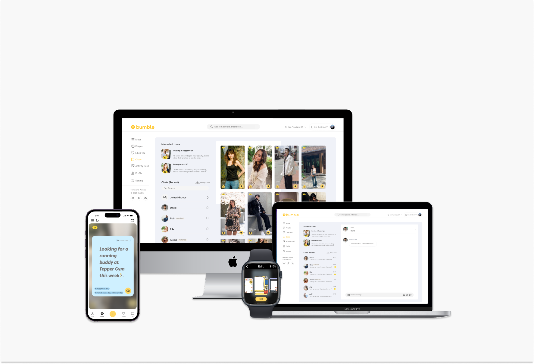
Overview
Interest Cards that turn nearby discovery into a Premium moment.
I was tasked with designing an enhanced precision location service for Bumble. The goal was to use precise location data and timely notifications to help users discover nearby matches faster, create stronger real-world connection opportunities, and increase Premium conversions — supporting Bumble’s mission to build a safe, meaningful platform for dating, friendship, and networking.
A direct look at the design
The four states the feature has to serve
Before the process, here are the four states the feature has to serve.
Problem
Location value users can’t see — so they don’t upgrade.
Despite Bumble’s large active user base, most aren’t Premium subscribers. Users struggle with low visibility of location features, insufficient notifications, and an unclear value proposition around location services. The result is missed opportunities for nearby connections — particularly in BFF and Bizz — which reduces engagement and conversion potential.
Goals
Make location worth sharing, and worth paying for.
Increase Premium conversion
Turn location value into a reason to upgrade.
Encourage location opt-ins
Make sharing location feel worth it.
Strengthen trust & safety
Give users — especially women — control.
This Interest Cards feature lets users post and discover location-based activities in real time. It serves BFF and Bizz users who want to meet new people or build local networks — by lowering the barrier to self-expression, surfacing nearby events, and creating more contextual touchpoints for Premium conversion.
Research
What makes people act on a nearby stranger.
I ran interviews and secondary research with people who had recently relocated, looking at how they start conversations and attend offline meetups. Users felt uncertain approaching strangers through generic profiles, but responded positively when activity-based context was provided. Female users emphasized safety and control — and many were willing to enable location once they could see a personal benefit.
Competitive analysis
Patterns worth borrowing
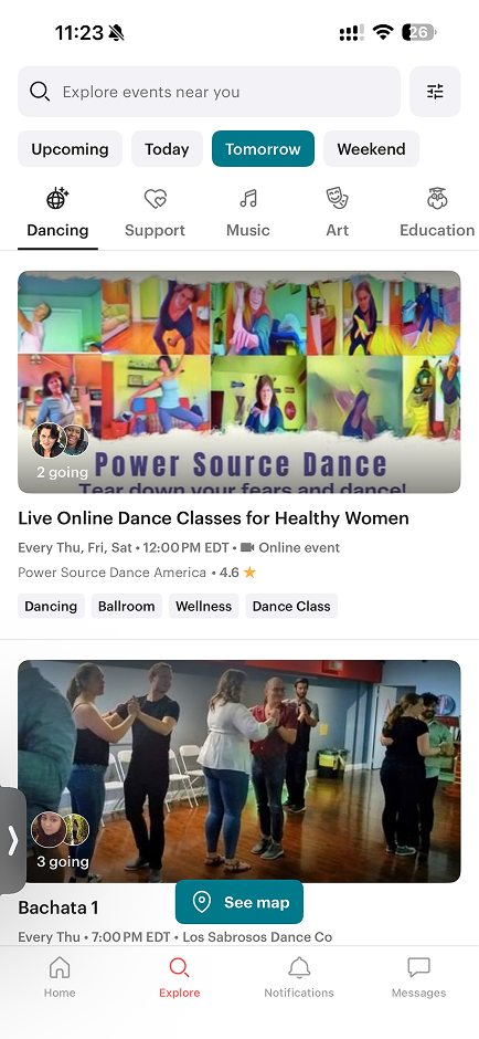
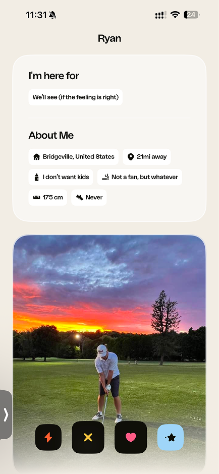
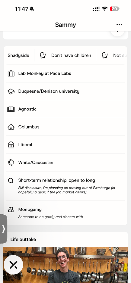
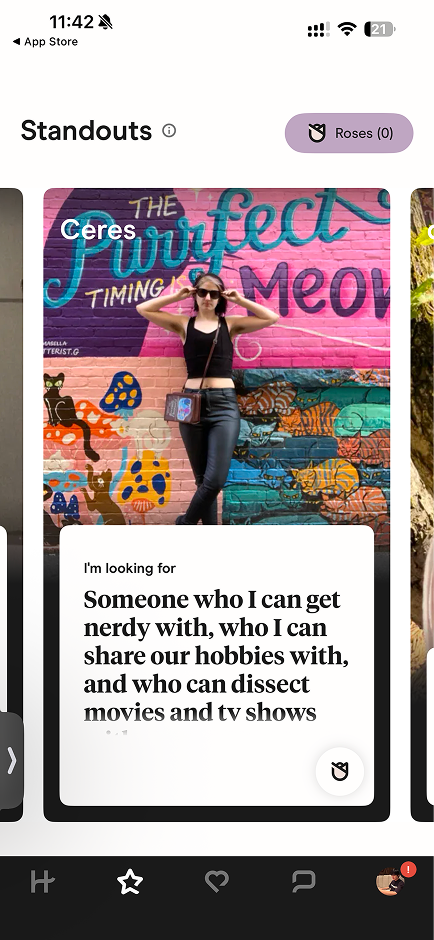
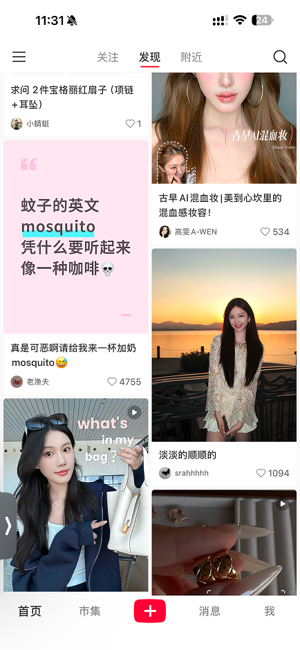
I reviewed social, dating, and events apps for patterns in how they use location and activity cues to drive engagement. Four stood out:
- 01Contextual anchors help people decide faster on joining an event.
- 02Location-based suggestions reliably increase offline interaction.
- 03Trust-building cues — mutual interests, photo previews — make interactions feel safer.
- 04Short, visually striking text posts lower the self-expression barrier.
Data analysis
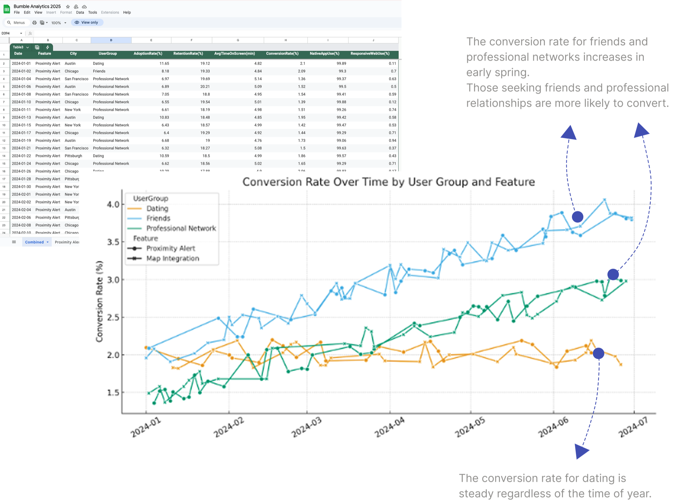
Friendship and networking peak in the warm months
Behavioral data showed that conversion for BFF and Bizz rises through spring and summer, when people are most open to forming friendships or professional relationships — while dating stays steady year-round. That seasonality informed a context-driven, location-based design.
Design
From Interest Cards to a publish-and-discover flow.
Ideation
Context-rich, low-friction posts
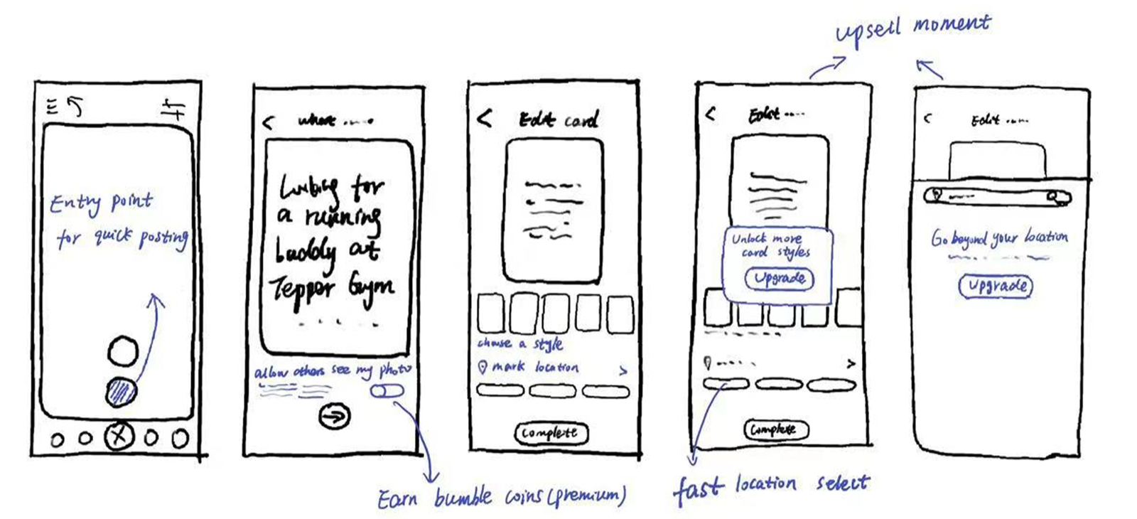
The core gaps were a lack of contextual entry points and unclear value around location. I explored Interest Cards — short, context-rich posts like “Looking for a running buddy at Tepper Gym this week” — and sketched multiple creation flows, each focused on adding activity, time, and location with minimal friction.
Site map
Layered into Bumble’s existing IA
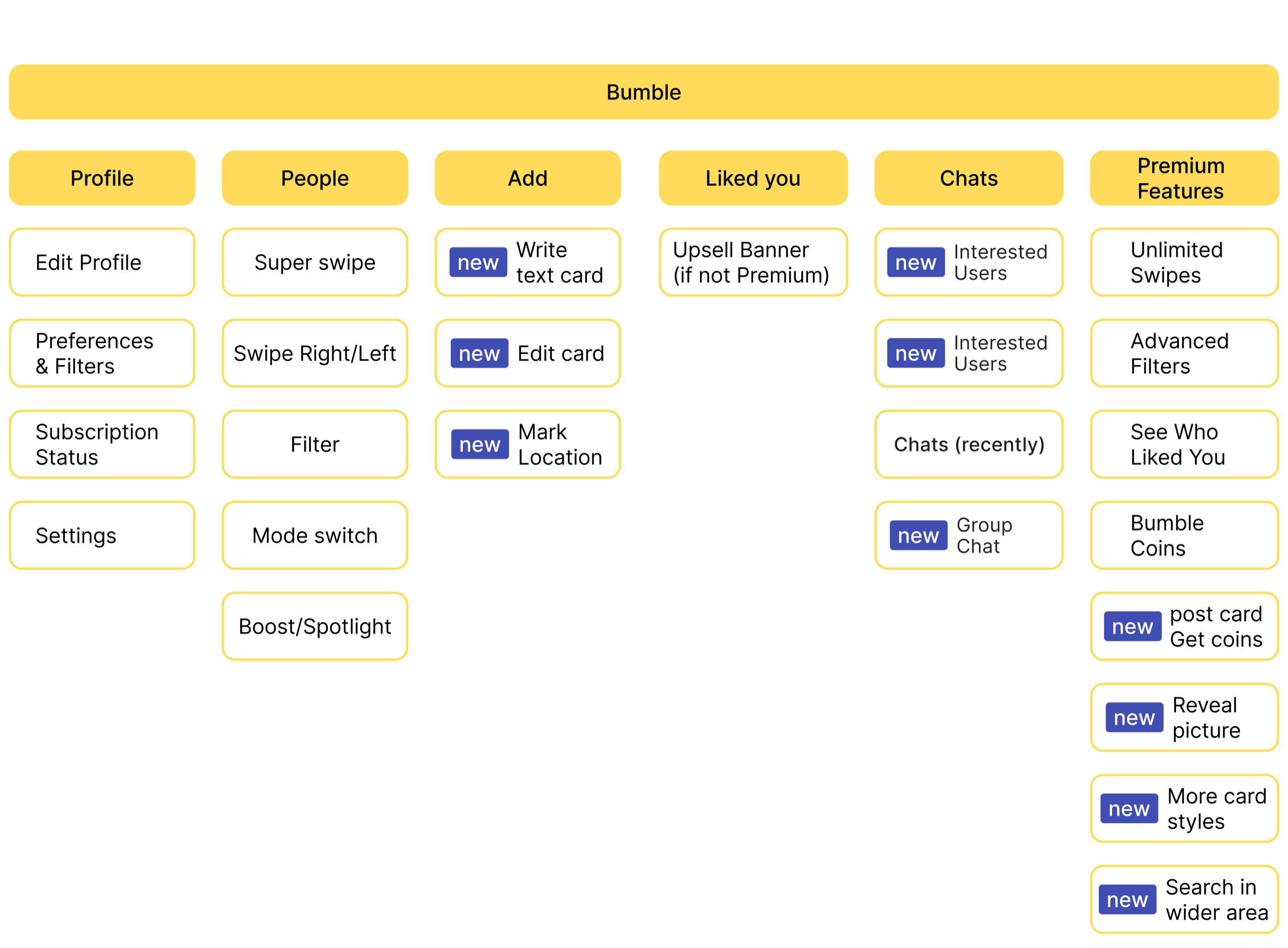
This site map shows how Interest Cards integrate into Bumble’s existing product structure. Building on the current IA keeps the learning curve low, strengthens engagement, and creates clear entry points for monetization.
User flow
Initiator and receiver paths
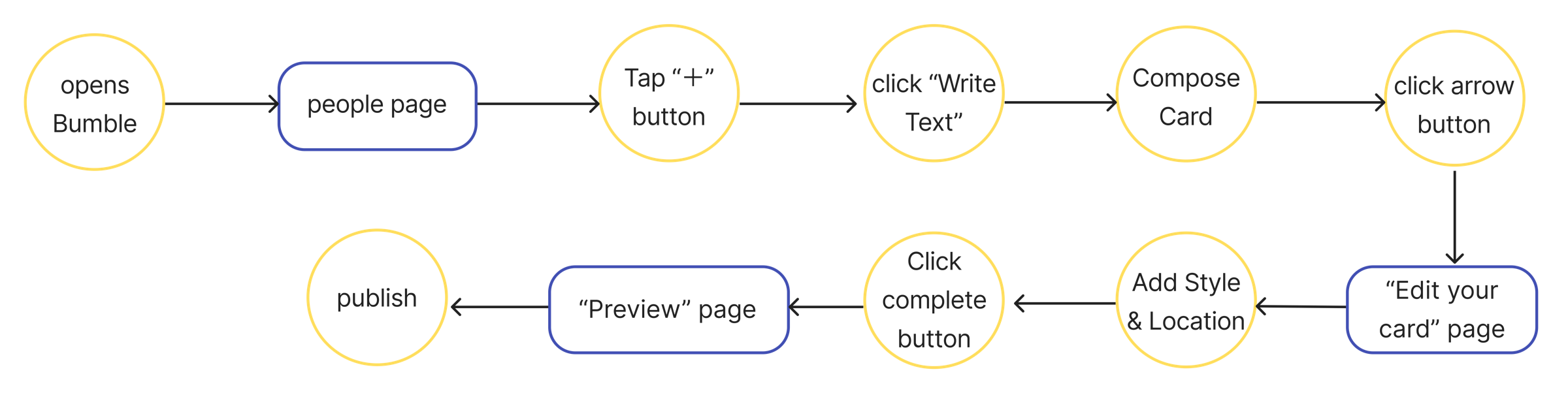
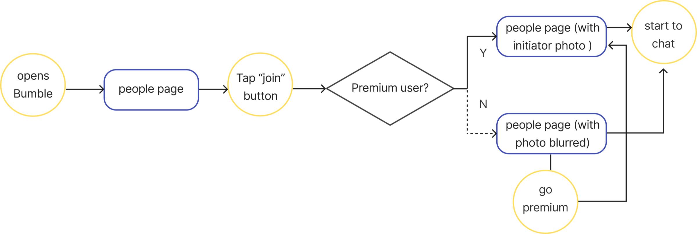
Two primary flows document the experience: initiators posting cards, and receivers discovering and responding to them.
Initiators — posting cards
Receivers — discovering cards
Interactions
Core interactions designed to increase conversion
To increase conversion, I embedded a few key interaction points across the initiator and receiver sides — each placed where it removes real friction.
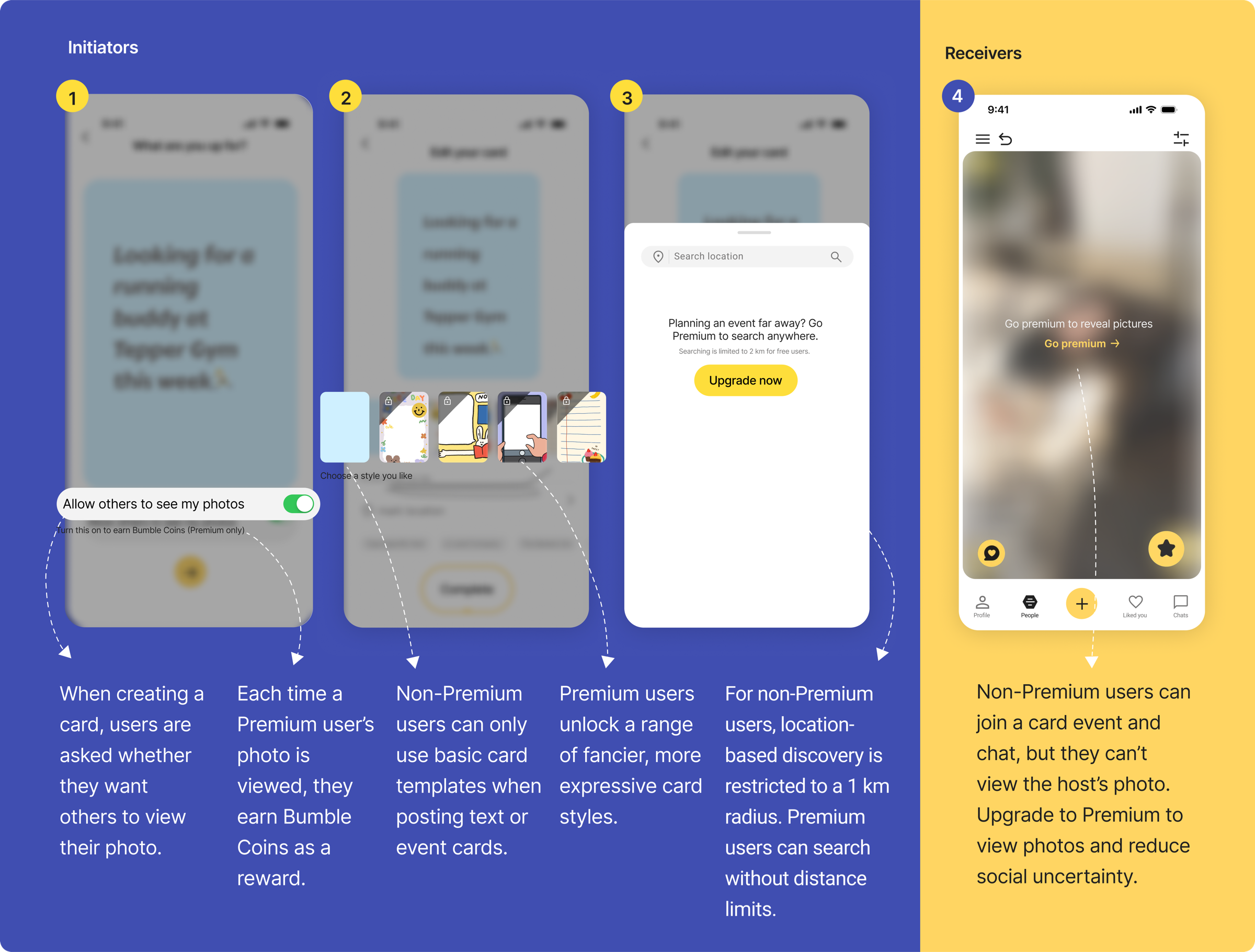
Photo display control
Users choose whether others can see their photo while creating a card.
Premium rewards
Each photo view by a Premium user earns the host Bumble Coins.
Card templates
Premium unlocks more expressive card styles; free users get the basics.
Discovery range
Free is limited to a 1 km radius; Premium searches without a distance limit.
Photo viewing
Free users can join and chat, but viewing host photos takes Premium — reducing social uncertainty.
Cross-platform
One experience, tuned to each platform.
The prototype was built for a consistent cross-platform experience across mobile and desktop.
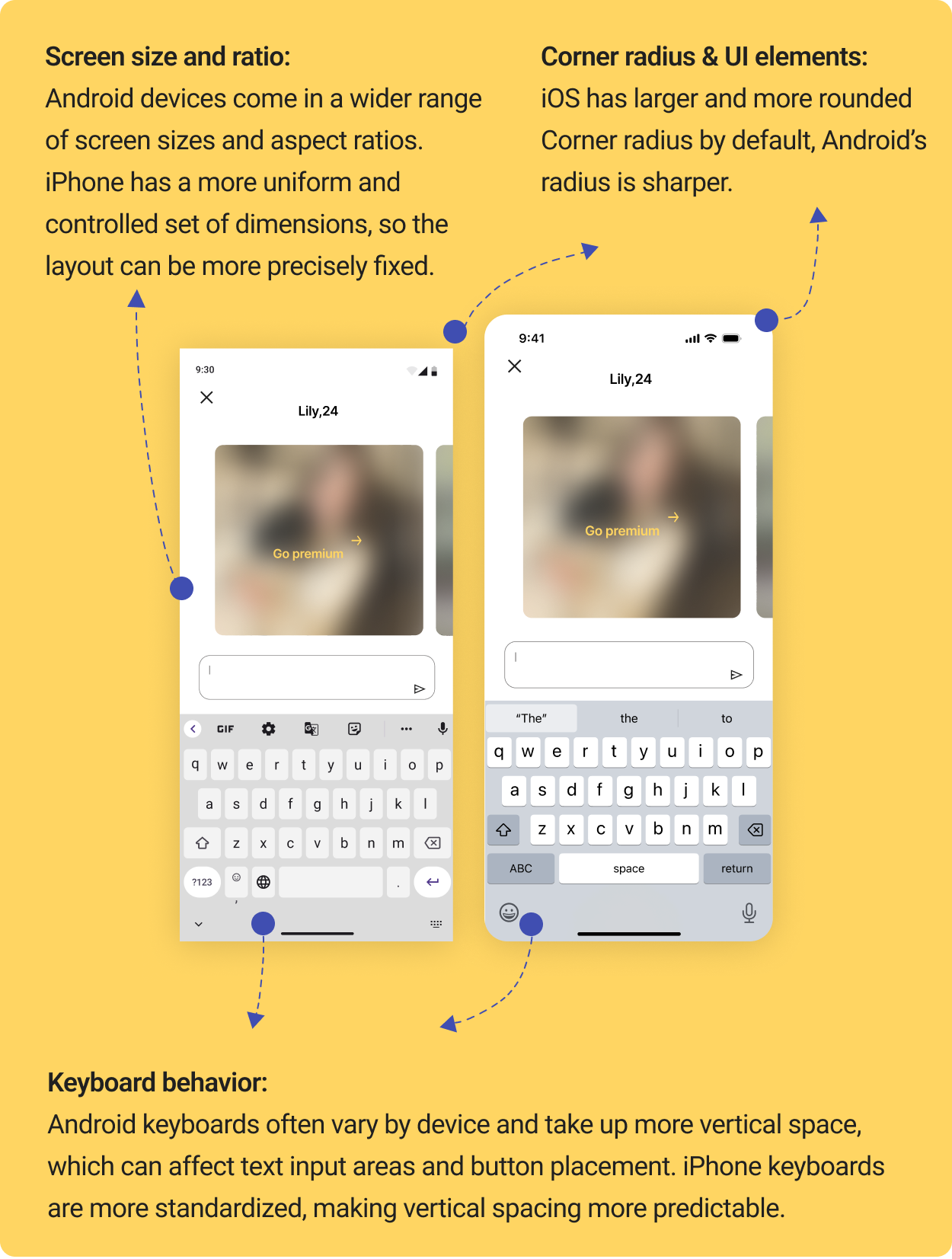
Android & iPhone
Same flow, native details
The flow is identical across Android and iPhone; only the visual and spacing details are tuned to each platform’s native patterns — corner radius, keyboard height, and screen ratios — for a familiar, seamless feel.
Desktop
One screen, more control
Desktop offers a larger canvas and more simultaneous control. I consolidated card editing onto a single screen, so users can adjust text, style, and location without page transitions.
Testing
30 users, under 20 seconds, 87% success.
I tested a click-through Figma prototype over two weeks with 30 BFF and Bizz users — free and Premium. Average task completion was under 20 seconds, with an 87% success rate. 73% found card creation intuitive, and 68% said location recommendations made it easier to act. I folded the feedback into the final design.
Takeaways
What this taught me.
This project let me design a feature that bridges user needs and business goals through intentional interactions. Adapting one experience across platforms took care, and the work reinforced how data-informed decisions and small interaction details shape behavior. With more time, I’d keep collecting behavioral data to refine when — and to whom — a card is worth surfacing.
Next steps
Where this goes next
- 01Refine cross-platform responsiveness for mobile, desktop, and Apple Watch.
- 02Enhance empty states to proactively guide users toward creating or joining activities.
- 03Optimize notification logic for more relevant, timely recommendations.