- Mobile App
- Design System
- AI-Assisted Workflow
Masii
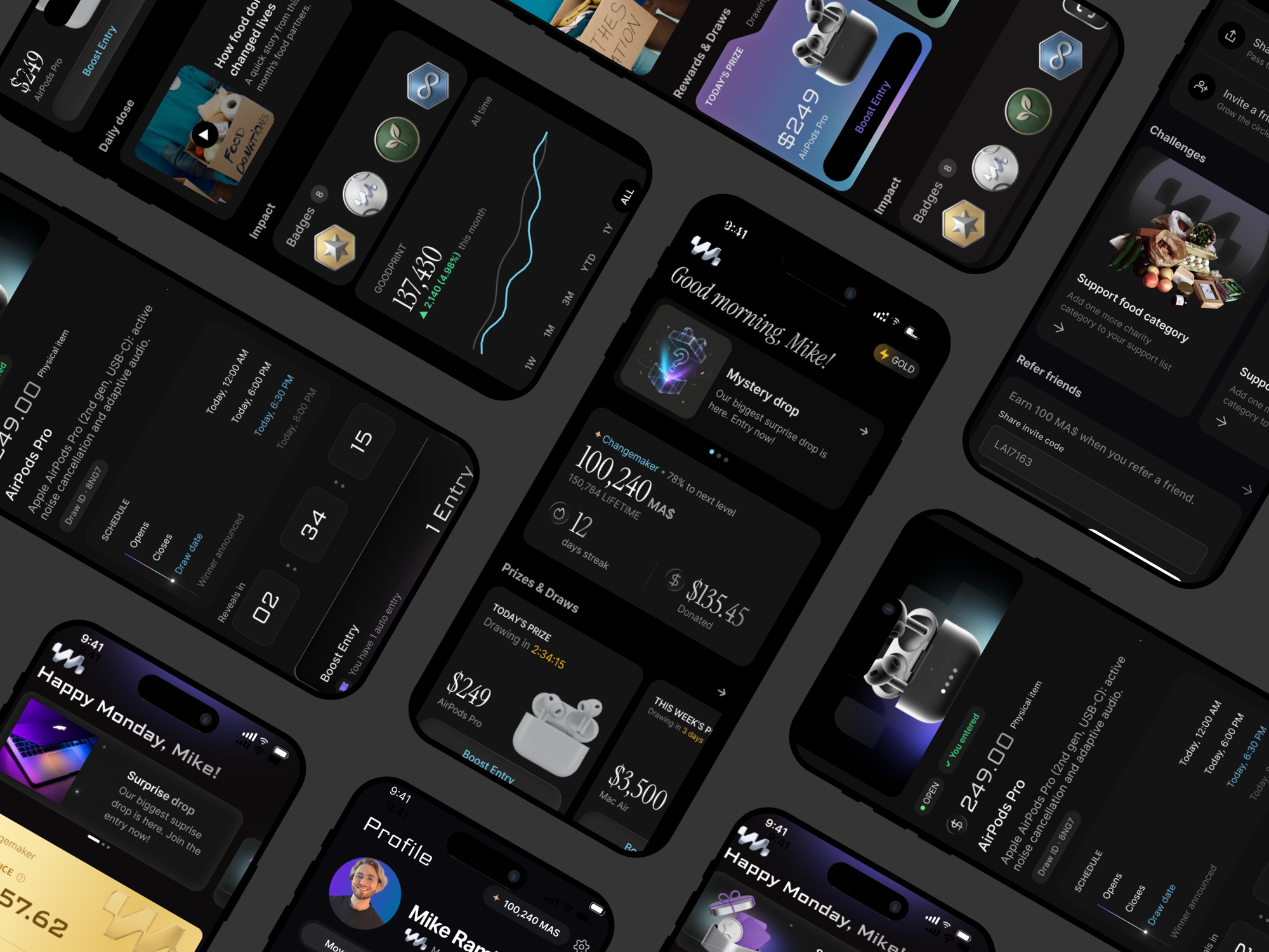
A mobile giving app for people who find charity apps boring and prize apps sketchy: make a small daily Move, earn MAS, and grow your GoodPrint.
- Role
- Product Builder
- Skills
- Design SystemPrototypingProduct ThinkingAI Workflow
- Timeline
- 17.5 days · 2026
- Tools
- Claude CodeFigmaMidjourney
Overview
A giving app that feels like none of them.
MASii is a mobile giving app for people who find charity apps boring and prize apps sketchy. The loop is simple: make a small daily Move, earn points called MAS, and grow your GoodPrint, a live picture of the good you are part of.
The giving model was already set. Members give through a monthly membership, so the money question was solved before the app even opened. The open question was tone. How do you make giving feel exciting enough to do every single day?
It came down to one observation. People do not skip giving because they do not care. They skip it because every app makes it feel like a chore, a bet, or a brag. Charity apps sell guilt. Prize apps feel like gambling. Social apps turn giving into a flex. My job was to build the one version that feels like none of them.
Screens designed and prototyped
Product tabs, plus onboarding
Traps to avoid: guilt, gambling, flexing
Odds or losses ever shown to a user
The problem
Where today's giving apps lose people.
Before designing anything, I looked at what already exists. Across the market, every category of giving app pushes people away the same way: it makes giving feel like something you would rather skip.
Guilt
They lead with need and dollar amounts. Giving starts to feel like a bill you forgot to pay.
Gambling
They show odds, entries, and near-misses. Giving starts to feel like a bet.
Flexing
They rank donors by dollars. Giving turns into a status game about money.
“The app must feel exciting and alive, but never drift into guilt-based charity or casino-like gambling.”
Solution
Every trap got a specific answer.
I turned each trap into a design rule, then built and checked every screen against it.
In the product
One small action, three payoffs, no donation ask.
MASii turns one small daily action into a reward, a growing impact score, and a shot at real prizes, with no donation ask on the home screen.
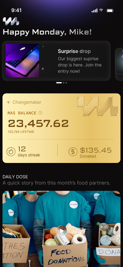
01 · Home is a command center
Status, Today's Move, today's prize, yesterday's winner, and GoodPrint, all readable in three seconds.
Product → UX
The rules every screen had to pass.
A short set of principles kept 150 screens coherent: a rubric for the AI to generate against, and a rubric for me to reject against.
Make the next action obvious
One dominant, consistently placed primary action per screen. No hunting for what to do.
One job per screen
Each screen carries a single main task; multi-step flows use progressive disclosure.
Reduce anxiety
Clear status, confirmation, and reversible actions, especially anywhere near money or prizes.
Plain language over jargon
Understandable words beat internal product terminology, every time.
Design every state
Empty, loading, error, and success are designed up front, not bolted on later.
Glow with restraint
Localized reflected light behind prizes, CTAs, and chart moments, never a full-page gradient.
The 3-second test
Before any screen shipped: is the next step obvious within three seconds? Is there one dominant action? Does it hold up in empty, loading, error, and success states?
Process
No users yet, so the product was the research.
There was no user base yet, so the research was the product itself. I read the PRD and the UX Bible, mapped every rule to a screen, and pressure-tested each design against the three traps before adding any polish.
Here is the whole pipeline, end to end. Hover or tap any step to see what happened there.
Step 1 of 8
Requirements & PRD
The source of truth: a bilingual PRD, a UX Bible, design tokens, and a set of working skills. Every rule here maps to a screen and a state, before a single pixel. Click a folder to open it.
Source of truth
Decisions & tradeoffs
Five calls, and what each one cost.
Two currencies, on purpose
MAS is the fuel you earn; GoodPrint is the impact you grow. Splitting them stops money from becoming the score.
Tradeoff Two currencies to teach instead of one.
Collective impact, never dollars
Impact reads "you helped feed 100,000 people," never "your $5 bought X." One line kills guilt and the money-flex at once.
Tradeoff You lose the concreteness of a personal, dollar-for-dollar receipt.
Rewards without the casino
Show today's prize, the winner, and the proof. Never odds, entries, or a loss. Membership auto-enters, so nothing feels like a bet.
Tradeoff Less urgency than countdowns and near-misses would manufacture.
Momentum without pressure
The Run, our streak, survives on any Move, never on spending. It pulls people back tomorrow without guilt or pay-to-win.
Tradeoff No paid streak-saves, a monetization lever left on the table.
Private by default
No public profiles, comments, or donor rankings. The energy is social; the mechanics are not.
Tradeoff Gives up the cheapest growth loop, but kept V1 small enough to ship.
What shipped
A complete V1, ready to hand off.
A five-tab information architecture, six end-to-end flows, and roughly 150 hi-fi screens with every empty, loading, and error state, built on an ~11-component design system and wired into a clickable prototype another designer can pick up cold.
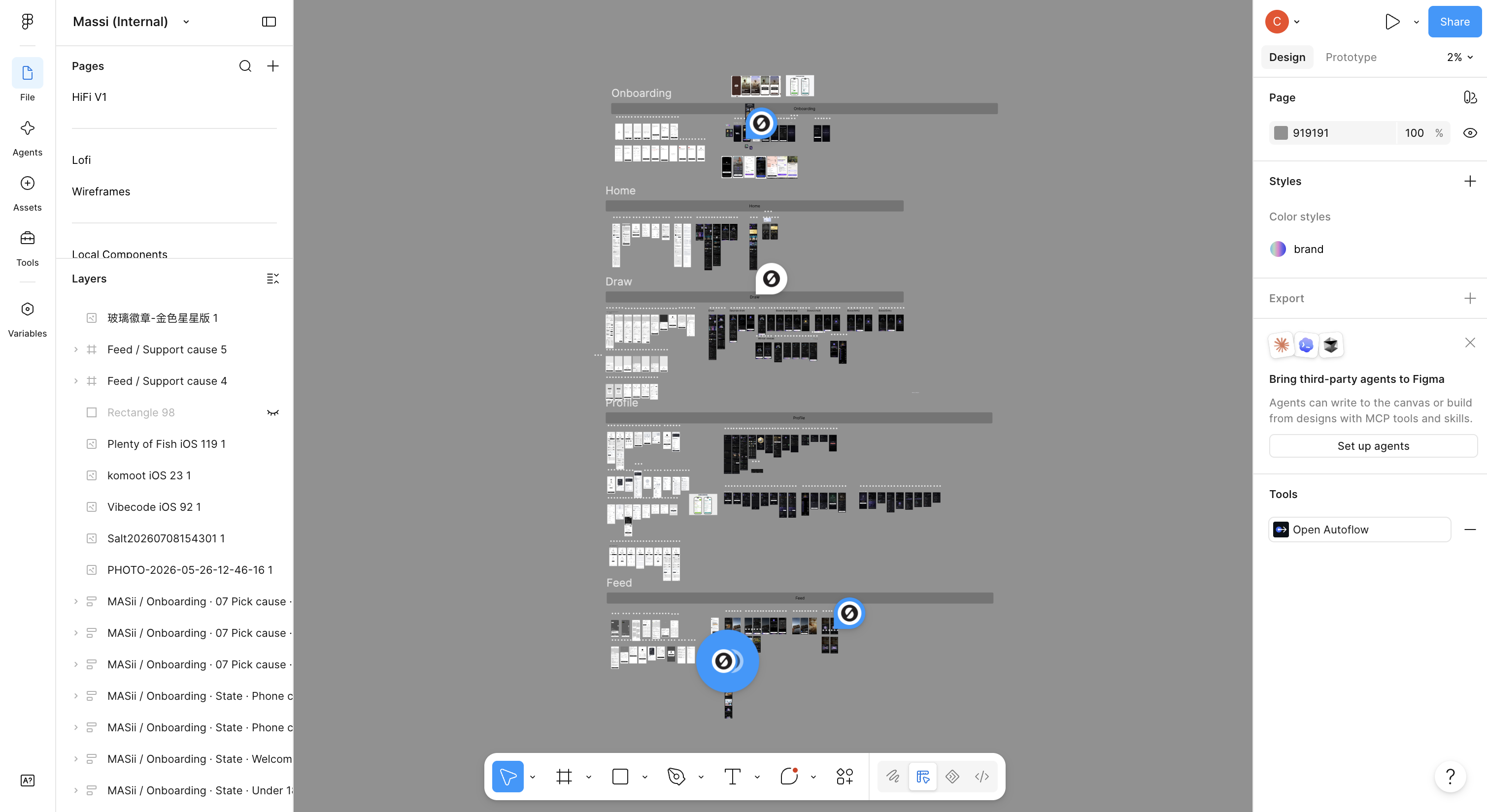
Split by module and fidelity
Lo-fi and hi-fi sections mirror each other across Home, Draws, Feed, Shop, Profile, and onboarding, with separate pages for components and tokens.
Success metrics
What I'd hold it to.
There were no users at launch, so the job was to define what winning means, not to report it. These are the metrics I'd measure the loop against.
Outcome
Roughly four times faster than a manual build.
The workflow itself is the outcome. Reconstructed from the session logs, the AI-assisted pipeline took 111.5 active hours. My estimate for the same deliverables built by hand in Figma, as a senior designer, is around 440 hours: about four times the work, or an eleven-week build delivered in 17.5 days.
Active build time
111.5hwith the AI-assisted workflow
Hours per phase
The manual-Figma hours are my own senior-designer estimate, anchored to the actuals, not a measured baseline. Treat this as an existence proof, not a controlled study.
What I’d do differently
- Test the three-second home screen with real users before building the full system, not after.
- Validate GoodPrint's real data source early: collective impact only lands if the number is true, not decorative.
- Design one non-social growth loop sooner: private-by-default kept V1 clean but left acquisition thin.
The test was never how much someone gave. It was whether they came back the next day.